Savera
The Modi Government’s Press Information Bureau released a statement on 5 July 2025, quoting World Bank data, to triumphantly claim that India has now become the fourth most equal country in the world. This has led the corporate media to a frenzy of celebration and praise for the government’s policies. It is bizarre that in a country with extreme inequality where billionaires thrive amongst millions who live in poverty and deprivation, the government and its apologists try to hoodwink the people, and the whole world, with such claims. In fact, it is criminal to hide the reality because this means that nothing will be done to eliminate or reduce the existing inequality that has surpassed even the era of British Raj.
What is the basis of the government’s claims? Let us investigate how this hoax has been perpetrated.
Gini Index: Consumption Spending vs Income
The World Bank periodically publishes data on various development indicators, which include a measure of inequality called the Gini Index. This index ranges between 0 (total equality) and 100 (total inequality). The basis of computing this index is income distribution in the country. That is, what share of the population earns what share of total income. So, what is needed to measure inequality through Gini Index is data on income.
In most of the advanced countries of the West, income data is collected directly from surveys of population samples. But in most developing countries like India, there are no income surveys. Long ago, the National Sample Survey Organisation (NSSO as it was then called) decided that determining household incomes in a largely agricultural economy is difficult. So, they adopted a method of collecting data on consumption spending. Periodically, sample surveys were carried out to find out how much households spend (consumption expenditure) every month. This is used as a proxy or substitute for income.
This works well for households with low incomes because most of their income is spent, with hardly any savings. So, the correspondence between earning and spending is largely correct. However, among the richer segments of population, only a fraction of the income is spent. The rest of it is stashed away. This leads to an underestimation of incomes of the rich if the surveys are only asking about household consumption spending.
The World Bank data on inequality does not distinguish between income surveys and consumption surveys although it does mention the type in its presentation.
The recent World Bank data being quoted by the Modi government thus has a list of countries with their respective Gini Indices. It shows India has a Gini Index of 25.5 in 2022. This is based on the 2022-23 Household Consumption Expenditure Survey carried out by the National Statistical Office (NSO, the new name of erstwhile NSSO).
In April 2025, the World Bank issued a ‘Poverty & Equity Brief’ which mentioned this data and specified that it was consumption based. It did not compare it to other countries because many of them would have income survey based data and the two are not comparable. In fact, World Bank, in its explanation about the Gini Index clearly says the following:
“Because the underlying household surveys differ in methods and types of welfare measures collected, data are not strictly comparable across countries or even across years within a country. Two sources of non-comparability should be noted for distributions of income in particular. First, the surveys can differ in many respects, including whether they use income or consumption expenditure as the living standard indicator. The distribution of income is typically more unequal than the distribution of consumption. In addition, the definitions of income used differ more often among surveys. Consumption is usually a much better welfare indicator, particularly in developing countries. Second, households differ in size (number of members) and in the extent of income sharing among members. And individuals differ in age and consumption needs. Differences among countries in these respects may bias comparisons of distribution. World Bank staff have made an effort to ensure that the data are as comparable as possible.”
The 2022 data series of Gini Index show 61 countries only, including India. Of these, about half have carried out income surveys while the others have done consumption surveys. China data is based on consumption survey, but Brazil’s data is income based. Most of the European countries and the US have income-based data. Back in 2011, when India’s Gini Index was computed as 28.8, there were 82 countries in the list. These were also a mixed bag of income and consumption-based data.
Despite this clear caution, that is well known to serious economists, the Modi government has unashamedly drawn up a comparison with other countries and declared India as the fourth most equal country. This is all the more shocking because actually there are just 61 countries in the 2022 list of GINI Indices, with other countries presumably not having relevant data for that year.
Consumption Data Underestimates Rich Sections
The biggest problem with consumption-based data is that the rich end of society – the billionaires and millionaires – are left out. They make up a small fraction of the population and are usually never covered in household surveys. Can you imagine an NSO surveyor visiting Mukesh and Nita Ambani in Antilla, Mumbai, to check out their monthly expenses? This problem is global, not just peculiar to India.
What this leads to is that the consumption expenditure of rich households is not factored in and thus their level of consumption is highly underestimated. In countries like India, where the maximum income and wealth are concentrated in the top 1% of population, this means that there is not much difference in the consumption levels of the rest of the people. This creates the illusion of more ‘equality’ as reflected in lower Gini Index.
Does this mean that there is no way of getting an idea of the consumption – indeed income itself – of the rich people?
No, serious economists and policy makers know how this lacuna can be fixed to a large extent. This will become clear in the following section where we discuss the true state of inequality in India.
India’s Real Inequality – And How It Is Measured
Economists at the World Inequality Lab have shown that inequality of income and wealth in India is at an all time high, with an acceleration witnessed in Modi’s rule. In a paper published last year, they gave the following figures:
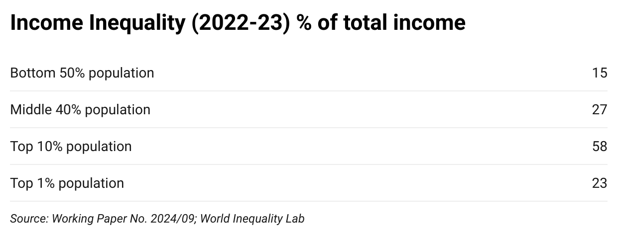
Of the total income generated, the poorest 50% of population gets just 15% while the richest 10% gobble up 57.7%. Nearly a quarter of the country’s income is captured by just the top 1% of population. It is clear that there is a staggering disparity of incomes between the richest and the poorest. This becomes clearer if one looks at the average annual income of each segment of adult population:
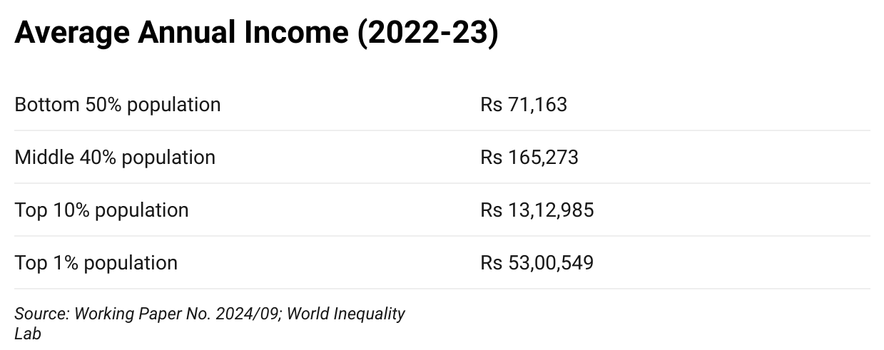
The top 1% earn 75 times more than the bottom 50% of India’s population. In fact, the richest 0.001% earn 2800 times more than the poorest 50%!
How have the economists arrived at these haunting figures? They have used National Accounts data, income tax tabulated data, and various NSO/NSSO surveys on incomes and consumption. In order to compensate for the missing rich sections from NSO ‘s household consumption spending surveys, they used income tax data to reflect incomes of the top end of society. Their methodology is transparent and given in detail in the paper linked above. While not perfect, the data is much closer to reality than what the government is trying to peddle.
A similar exercise has been done for computing wealth inequality by the authors in the same paper. Note that wealth is a cumulative figure while income is what accrues in a limited period. So, there is a difference in both, its origins and its sustenance.
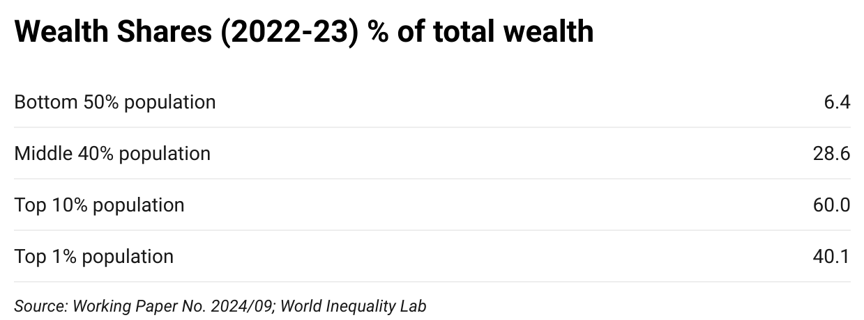
The total wealth owned by the poorest 50% of people in India is a mere 6.4% of the total wealth whereas the richest 10% people own a jaw dropping 60% share. As in the case of income, the authors have provided average wealth estimates for each section:
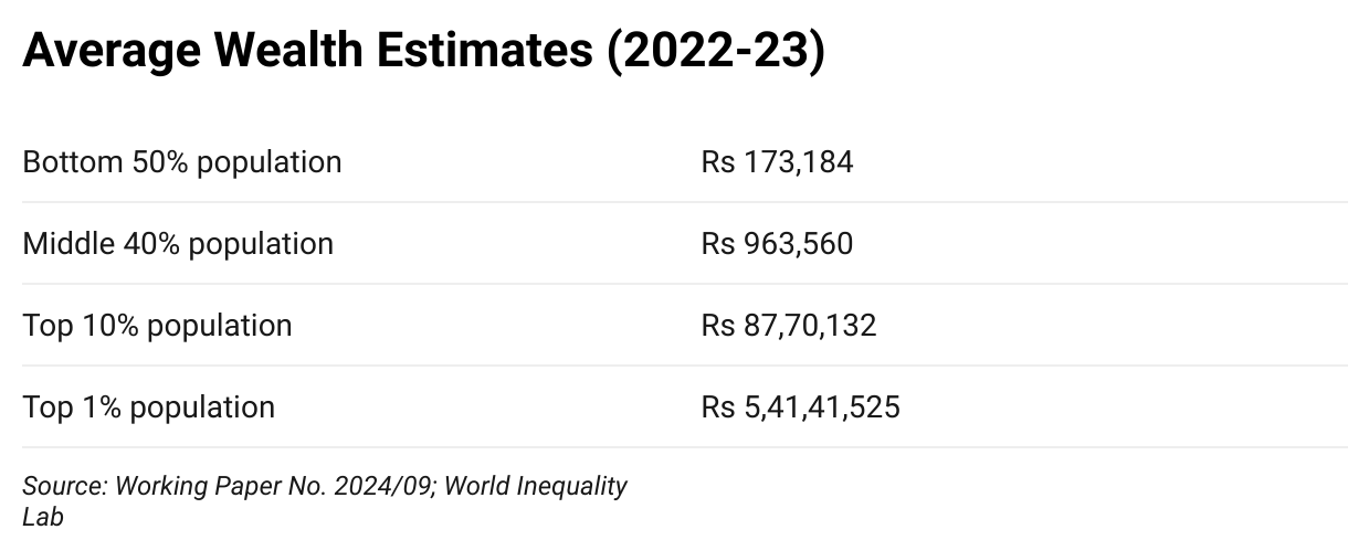
The average wealth owned by the poorest 50% people in India is about Rs.1.7 lakh. The Richest 10% people own wealth of about Rs.88 lakh, and the richest 0.001% own, on an average, Rs.2261 crore (that’s 1.3 lakh times more than the poorest 50%).
These figures have been estimated using the national wealth aggregates, NSO’s All India Debt & Investment Surveys (AIDIS), and Forbes billionaire rankings.
From the above brief description, it is clear that inequality in India is pervasive and deep.
Comparison with Some Other Countries
Since similar methodology has been applied and differences adjusted, it is possible to compare India’s inequality with other countries. For this, the authors use the World Inequality Database for data on a few other countries.
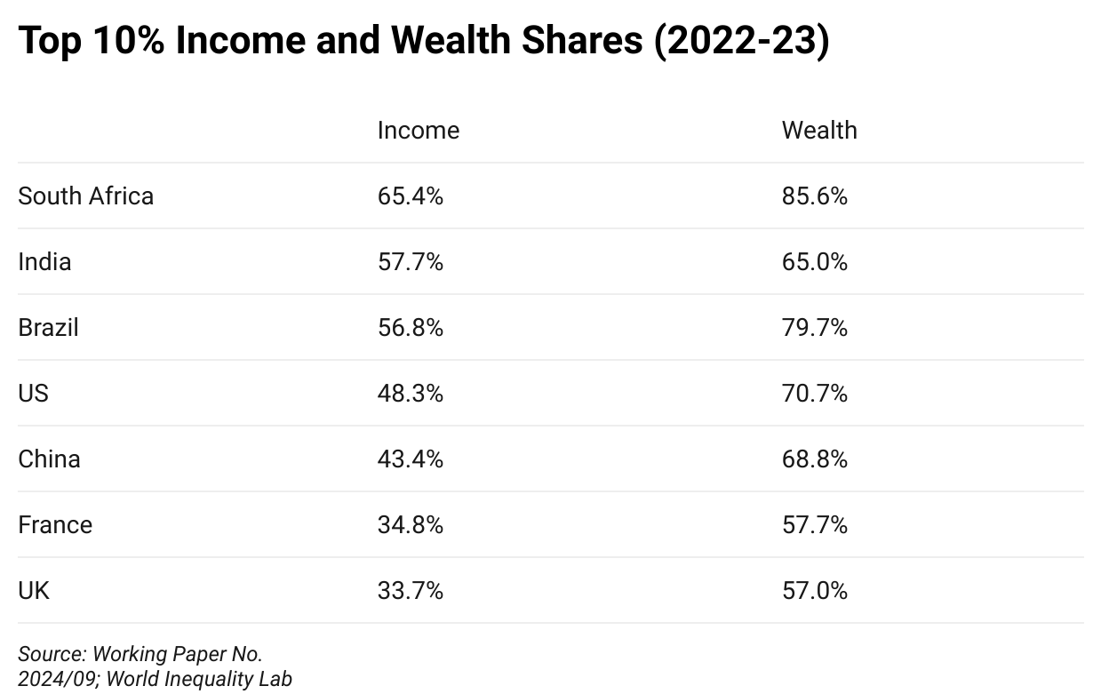
For income inequality, India is second only to South Africa. The top 10% of population gobbles up over 65% of national income in South Africa, representing extreme inequality. In India, this share is nearly 58%. If one looks at the top 1% share of income, India beats even South Africa with a share of nearly 23% national income accruing to the richest 1%. These are clear signs of the brazen and dire inequality that the government appears to be trying to hide.
In terms of wealth concentration, India is somewhere in the middle with the top 10% owning 65% of wealth. South Africa has the highest concentration at nearly 86% followed by Brazil, US and China, and then India.
The government’s claim of being the fourth most equal country is completely erroneous. It is difficult to believe that all the whiz-kids that run the government’s propaganda machinery are so naïve or foolish that they make the mistake of taking a list of 61 countries, calling it the ‘world’ and comparing Gini indices despite a clear caution that it cannot be done. The inescapable conclusion, therefore, is that the Modi government does not care about truth or validity – it believes that it can call the day night and get away with it. This is a symptom of complete disconnect with reality and an insult to the people of the country.